BRAND
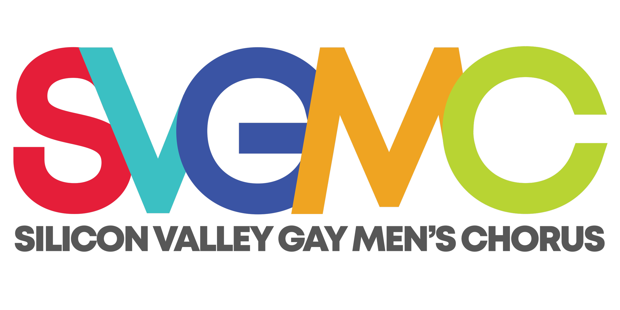
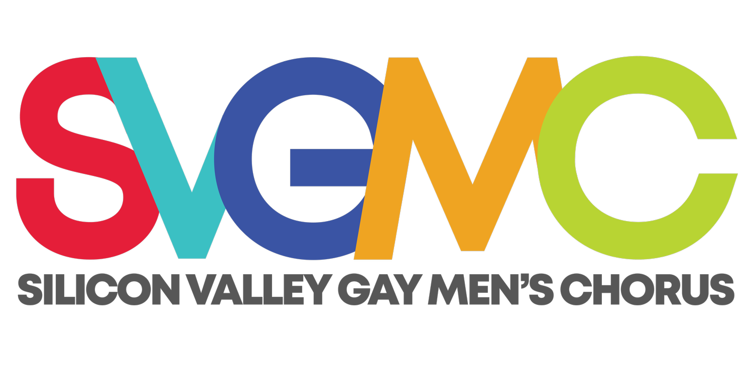
SVGMC’s logo has been through various permutations, from a script typeset when the organization was called the Liedermann Chorus of San Jose in 1983, to the most recent iteration with an absent apostrophe in “Men’s.”
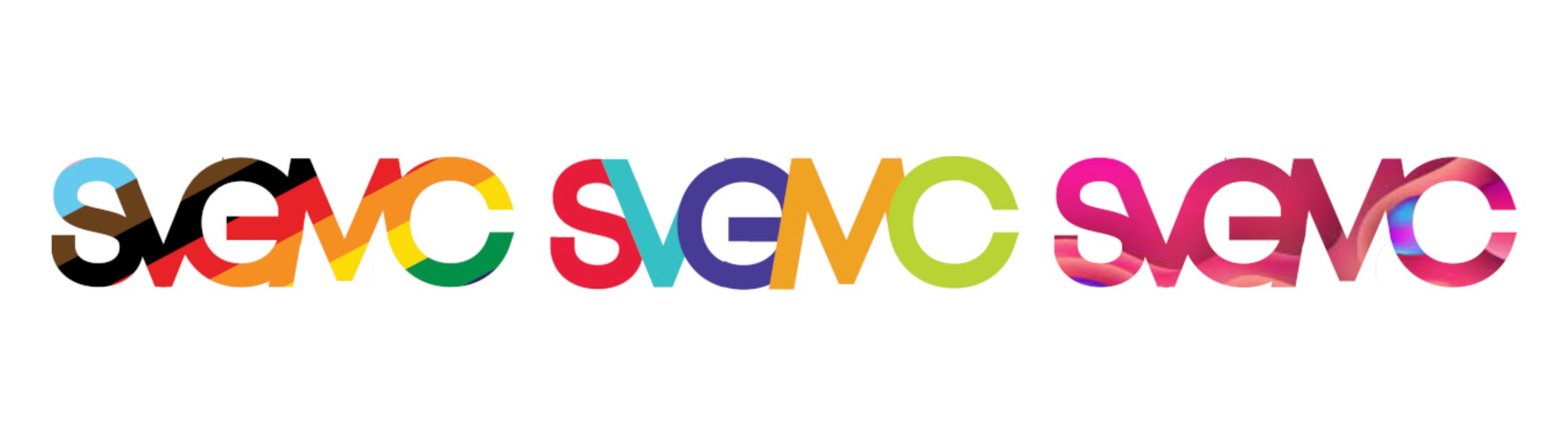
This logo directly responds to the ever-changing membership of our chorus and community. It’s fluid, by design, like our community and singers. Our logo can evolve and change, and it’s not sacred. Gone are the days of adhering to just the original colors of the rainbow Pride flag.
SVGMC’s logo is not fragile or precious. The letters meld into each other, weaving and sometimes morphing into the next. And that too is intentional because it visually represents how our organization and community are stronger together.
Lastly, the “M” in SVGMC’s logo: why is the “M” not whole? Well, when SVGMC was first founded, like many gay men’s choruses around the world, the focus was on queer men. And that made sense at the time. But SVGMC is no longer made up of just cisgender men. SVGMC is proud to welcome anyone who can sing as a tenor, baritone, or bass, regardless of gender, sexuality, abledness, or ethnicity.
SVGMC’s logo was designed by Carrie Ford Hilliker + Wilson Alexander Aguilar.